
Visual identity system for a sublimation company
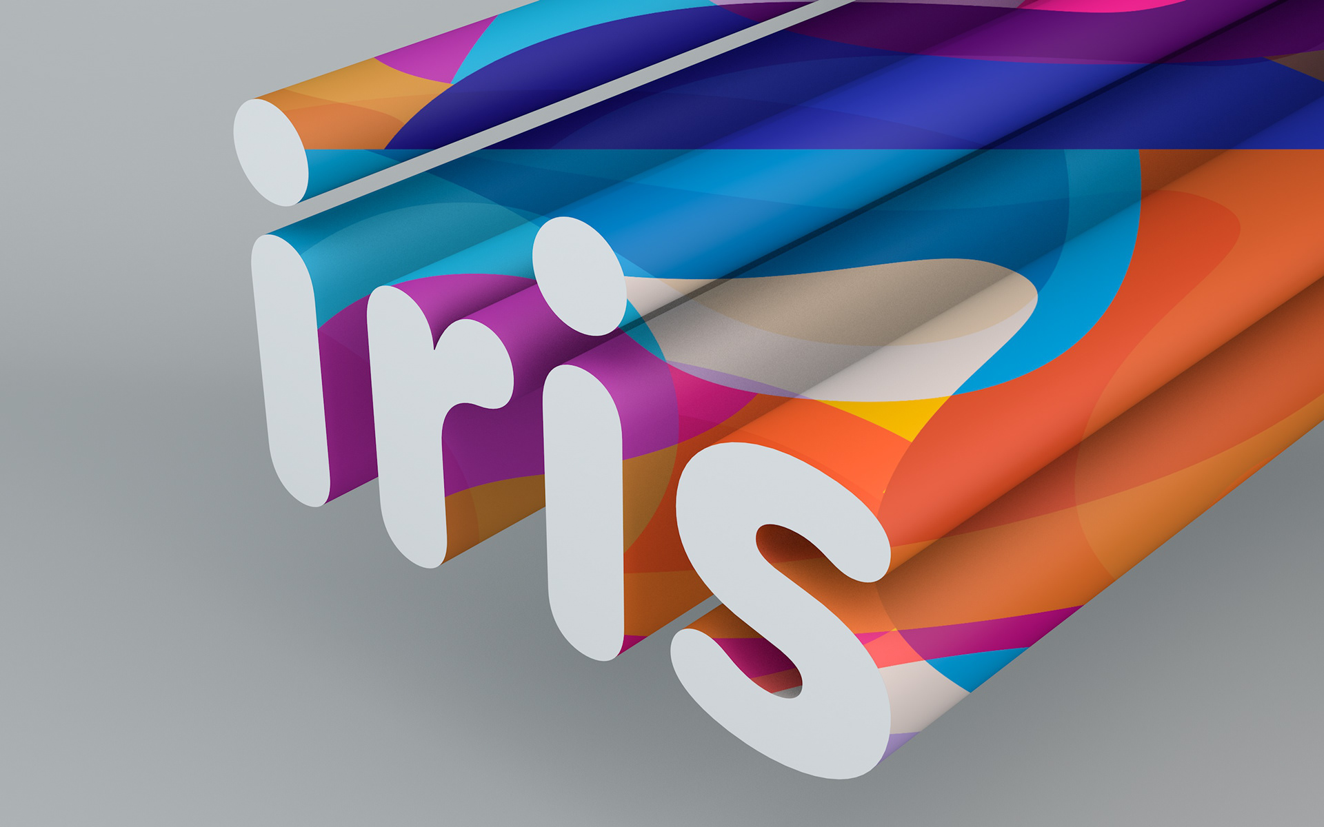
Development of a visual identity for a sublimation company, focused on conveying versatility, color, and adaptability across multiple surfaces and formats.
Logo
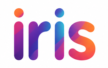
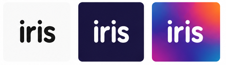
A typographic logo was designed with soft, contemporary forms, prioritizing legibility and versatility across different applications and scales.
Dynamic visual system
The identity is built on a graphic system based on color overlays and fluid shapes, referencing the transfer and application processes inherent to sublimation.
Color system
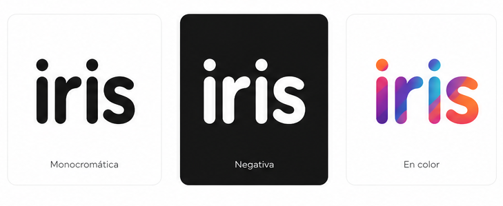
A vibrant color palette was defined, reflecting the diversity of possible substrates and outcomes in sublimation processes, allowing for multiple combinations within a unified system.

Applications
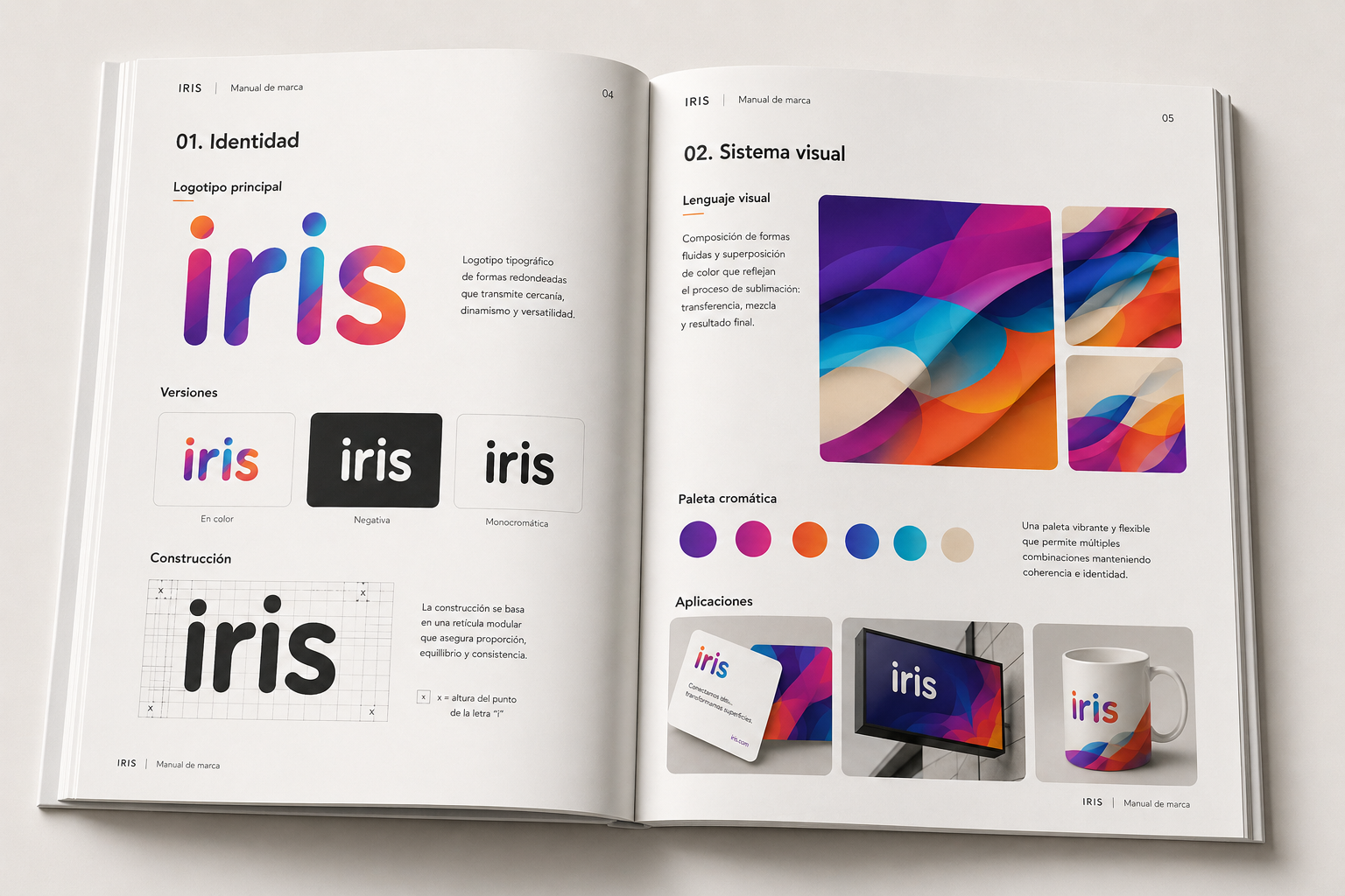
The identity was designed to adapt to different products and surfaces, maintaining visual coherence across every application.
