

Visual identity and packaging
Artisan cakes: naming + visual identity + packaging system
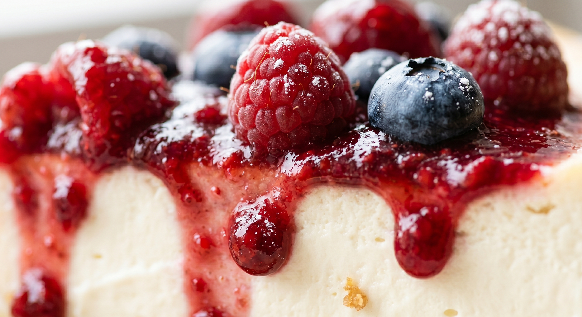
A cake brand that turns homemade baking into a visual experience.
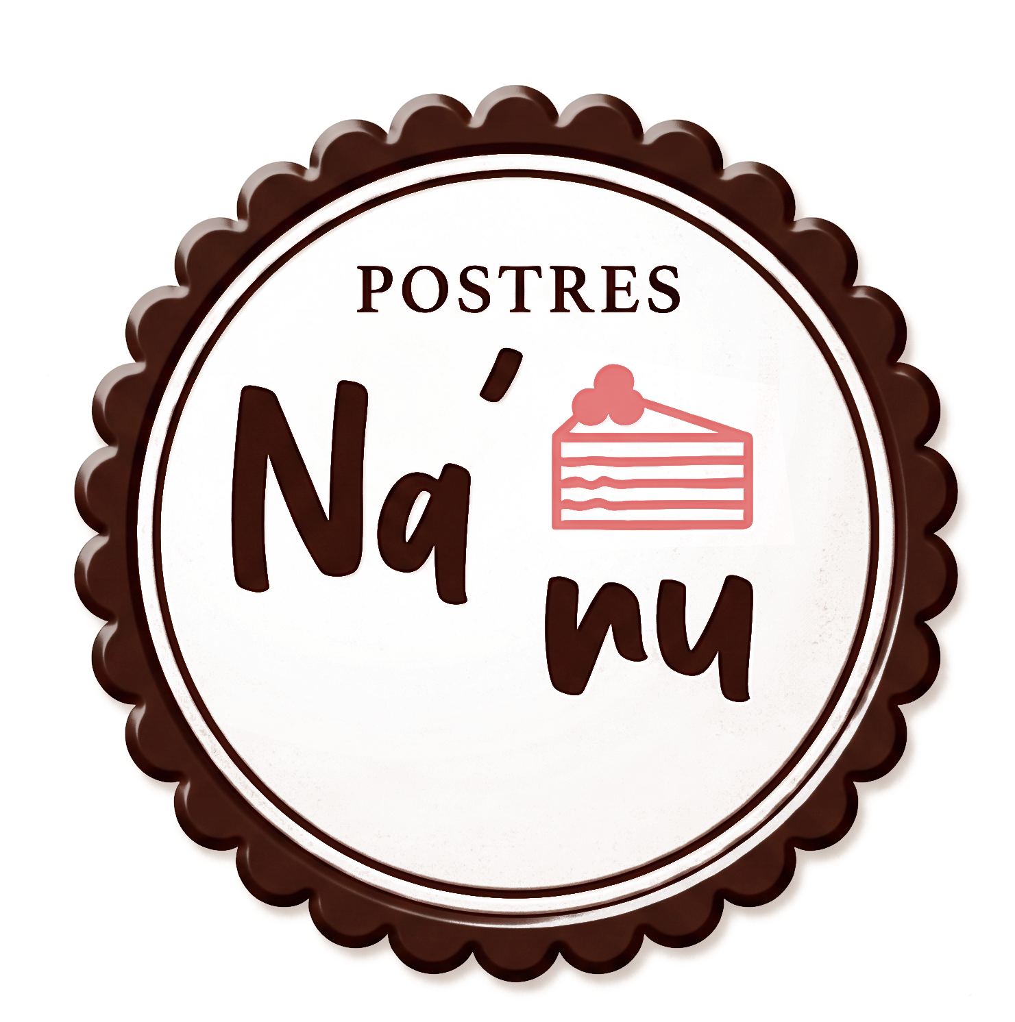
Ná Nu is a cake brand built from desire: warmth, sharing, and something freshly made.
The name emerges as a central decision within the brand system. Its short, rhythmic, and repetitive sound gives the brand a close and memorable character, acting as the first point of recognition within the experience.
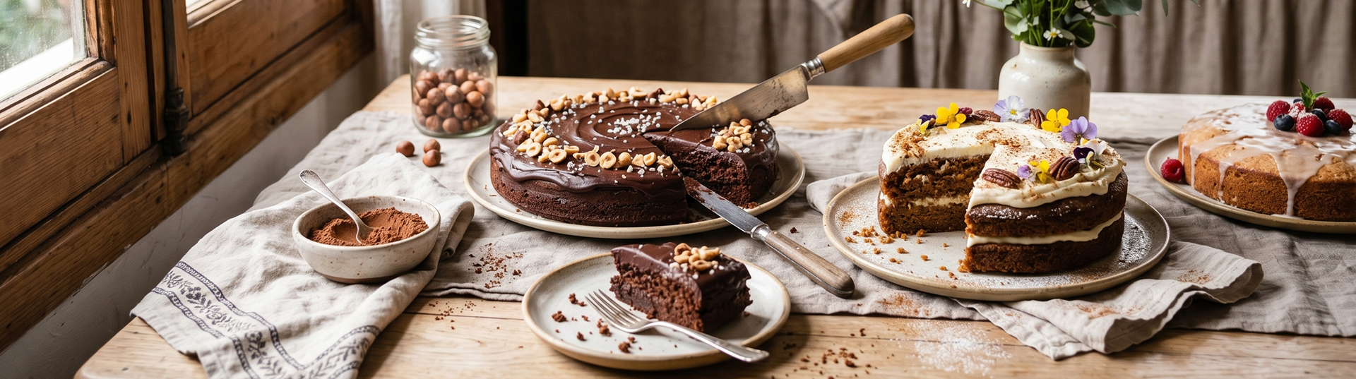
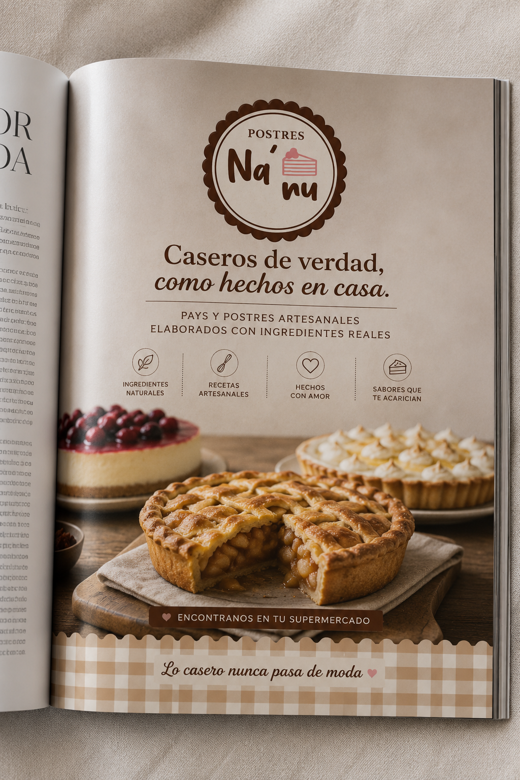
The visual system translates the idea of oven, texture, and sweetness into a simple, approachable, and recognizable graphic language.
The focus is placed on the product as the protagonist, with an identity that supports rather than competes.
The name emerges as a central decision within the brand system. Its short, rhythmic, and repetitive sound gives the brand a close and memorable character, acting as the first point of recognition within the experience.
The visual system translates the idea of oven, texture, and sweetness into a simple, approachable, and recognizable graphic language.
The focus is placed on the product as the protagonist, with an identity that supports rather than competes.
Visual direction
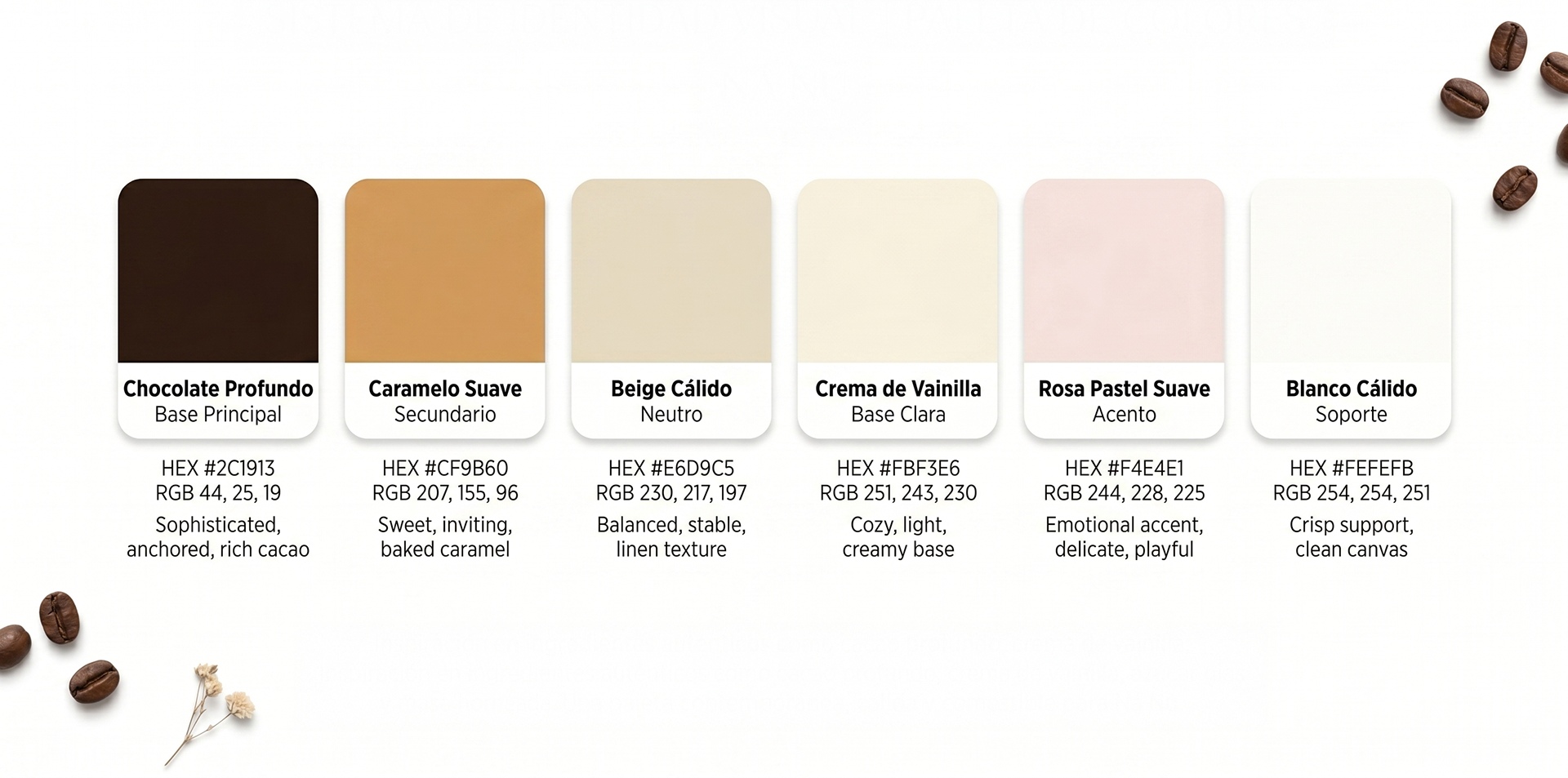
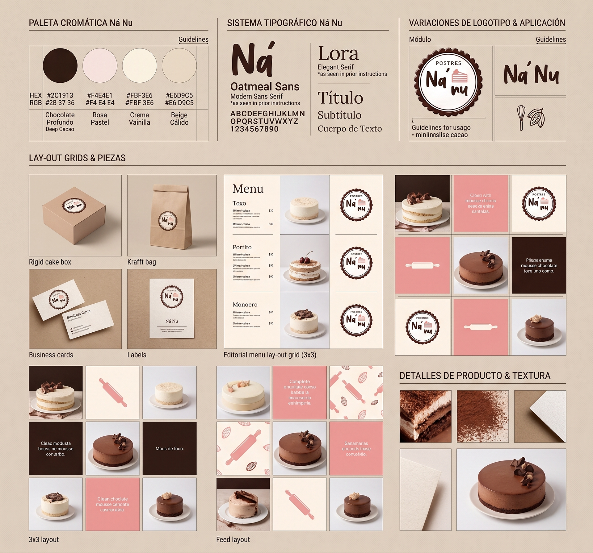
The Ná Nu visual system is built on a central color combination defined by deep chocolate and pastel pink.
Chocolate acts as the structural base of the brand: it provides contrast, visual weight, and a sense of indulgence associated with the world of cakes.
Pastel pink appears as an emotional accent, softening the identity and adding closeness, warmth, and a more delicate character.
The palette is complemented by warm neutrals that allow the product to remain the focal point across all applications.
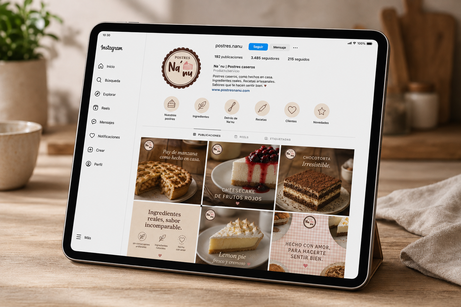
The intention of the system is to balance the artisanal and the contemporary, creating a recognizable, appetizing, and consistent identity across all touchpoints.
Chocolate acts as the structural base of the brand: it provides contrast, visual weight, and a sense of indulgence associated with the world of cakes.
Pastel pink appears as an emotional accent, softening the identity and adding closeness, warmth, and a more delicate character.
The palette is complemented by warm neutrals that allow the product to remain the focal point across all applications.
The intention of the system is to balance the artisanal and the contemporary, creating a recognizable, appetizing, and consistent identity across all touchpoints.
Identity
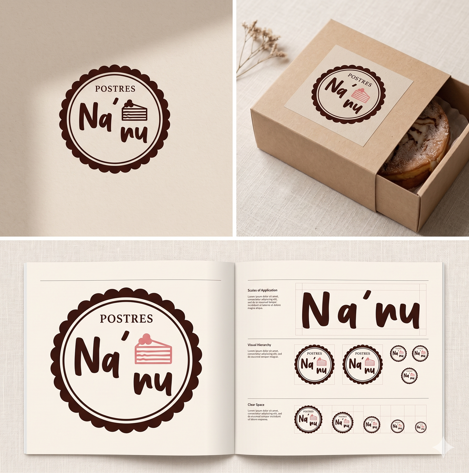
The logo is built on a simple typographic relationship, with flexible application across packaging.
The primary color identity is defined by the combination of chocolate (structural base) and pastel pink (emotional accent).
The system prioritizes legibility, memorability, and adaptability across different formats.
The primary color identity is defined by the combination of chocolate (structural base) and pastel pink (emotional accent).
The system prioritizes legibility, memorability, and adaptability across different formats.
Packaging
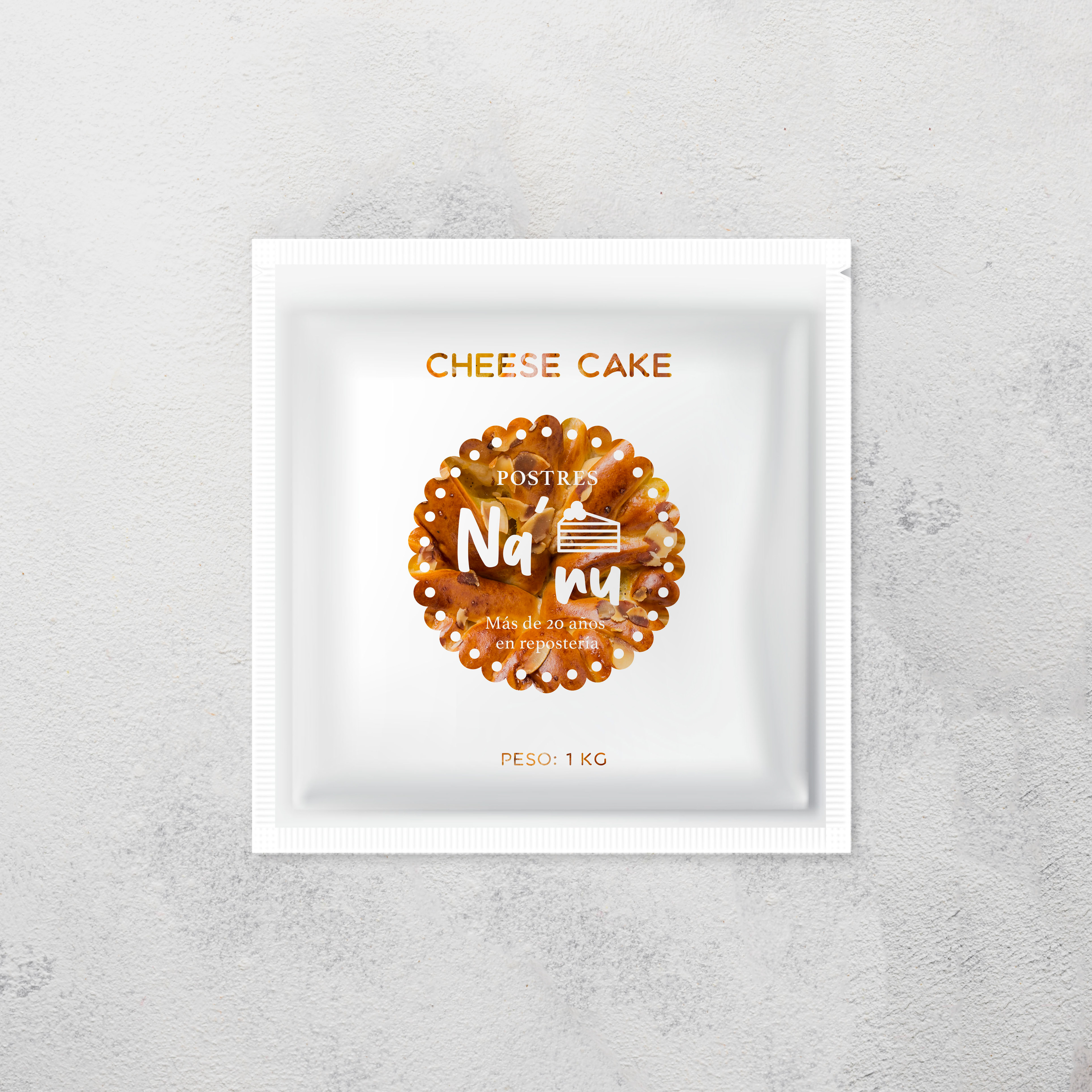
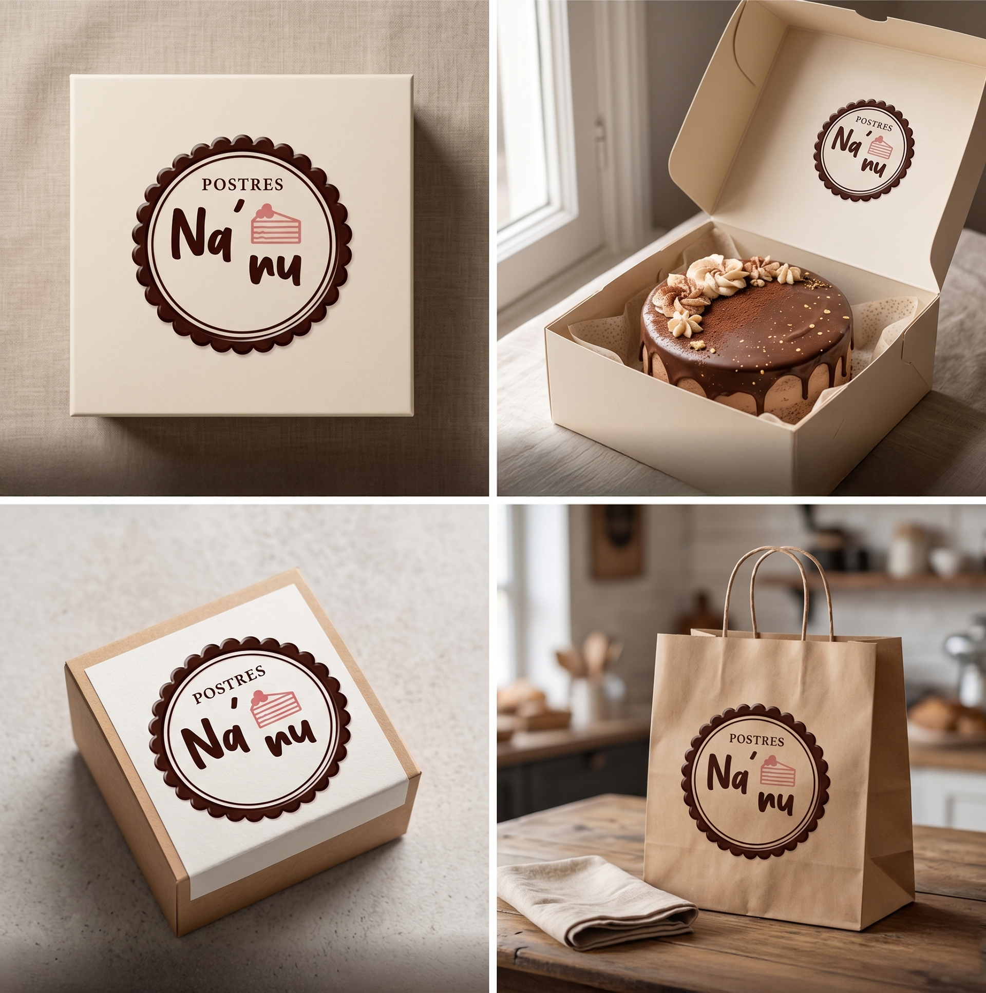
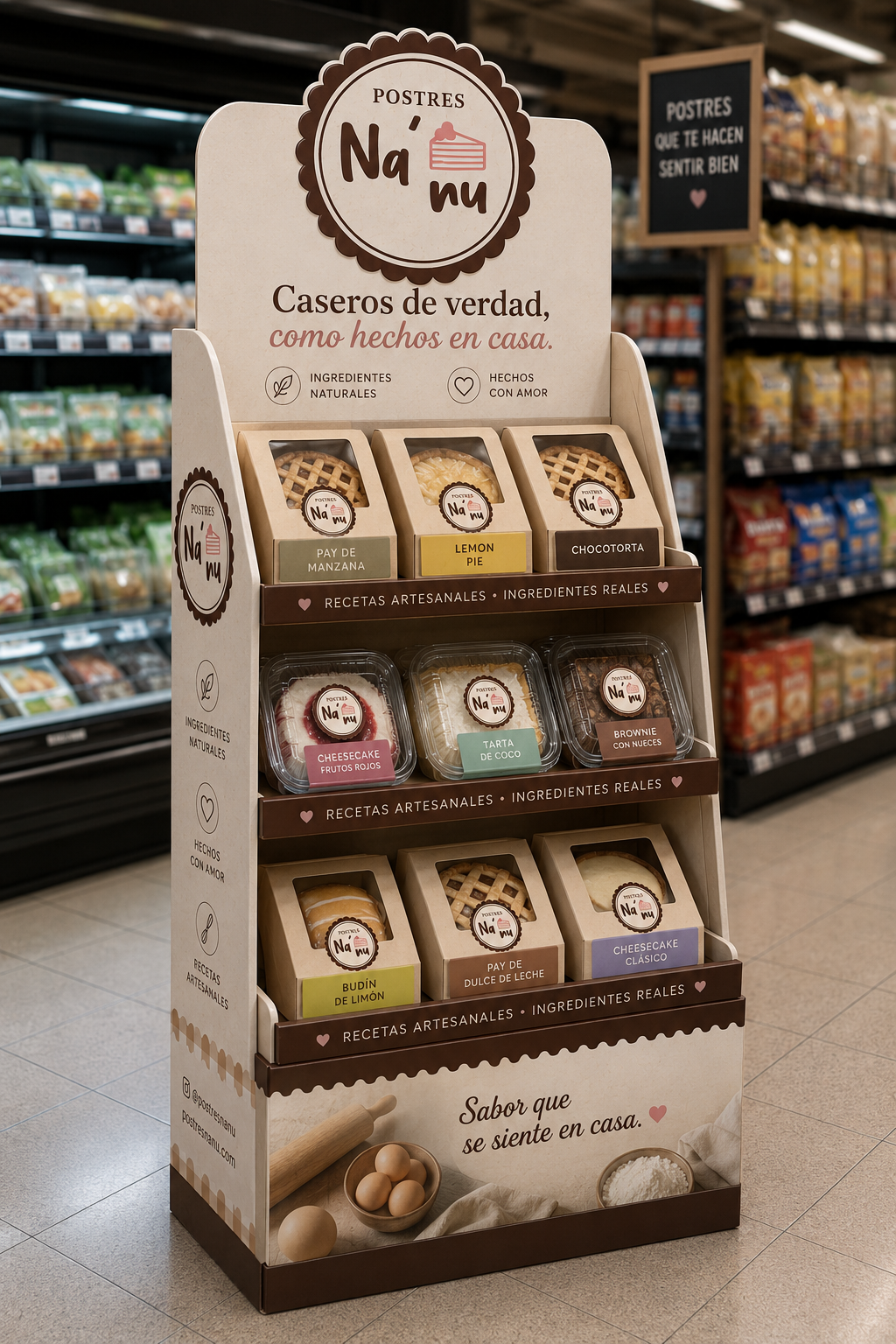
The packaging system is designed for different cake formats and presentation needs:
main boxes for full cakes, product labels, and delivery bags.
Each application maintains visual consistency and reinforces the brand’s warm universe.
Color functions as a quick identification system at the point of contact.
main boxes for full cakes, product labels, and delivery bags.
Each application maintains visual consistency and reinforces the brand’s warm universe.
Color functions as a quick identification system at the point of contact.
Graphic system
The system is based on:
soft color blocks and controlled contrast,
simple and clear hierarchies,
product-centered composition,
and visual textures associated with craftsmanship.
The goal is to create a flexible identity while maintaining coherence across all touchpoints.
soft color blocks and controlled contrast,
simple and clear hierarchies,
product-centered composition,
and visual textures associated with craftsmanship.
The goal is to create a flexible identity while maintaining coherence across all touchpoints.
Results
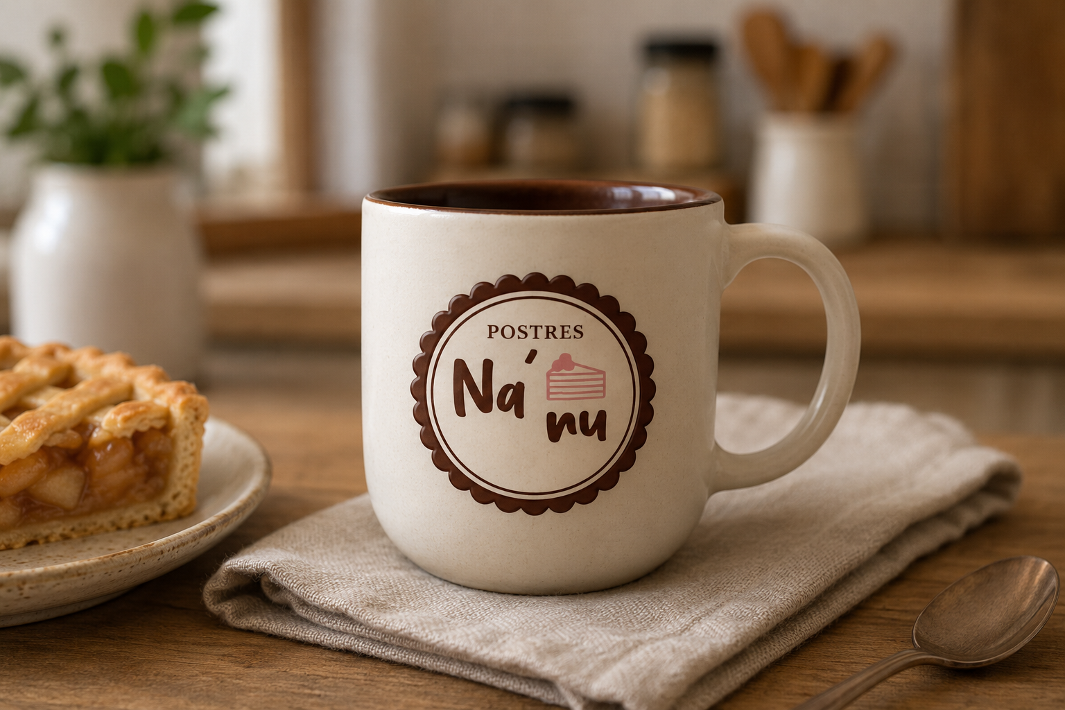
Ná Nu positions itself as a close and warm brand, where design supports the product experience without overstating it.
The system achieves a balance between artisanal, emotional, and contemporary elements, with a consistent and recognizable visual language.
The system achieves a balance between artisanal, emotional, and contemporary elements, with a consistent and recognizable visual language.
Credits
Identity, naming, and packaging design - Laura Rojo